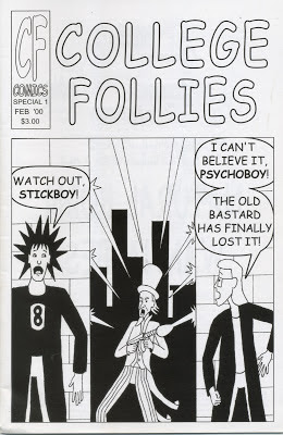
So the original version of the first issue, of which only a few dozen copies were produced at a local print shop, didn't print well. The line art ended up looking squiggly (like something out of Dr. Katz), probably from bad compression or low resolution.
This was back in the year 2000, when it was a challenge working with and storing files big enough for print and I didn't know what I was doing. Back then I had to fit all my art class projects on a zip disk that held 100 megabytes. Nowadays I have single projects that are 100 megabytes a piece. The technology has made quantum leaps, so big files are no problem now.
So when I redid the cover, like the rest of the comic, it needed to be rescanned from the original inks. I scanned in the printed comic too to pull the lettering from, since the lettering turned out okay in the comic. So all I had to do was scan in the cover, pull the word balloons and text, slap them together, add color and call it a day. Simple, no?
Well, I went through the entire process and produced a final PDF. I then double checked Comixology's submission guidelines to see if I got the size exactly right. I ended up stumbling on a bit on there that pages should not look pixelated if you zoom in to 300 percent. As I was working on it, I only viewed the cover in the size that matched how big Comixology's comics were on my computer. It never occurred to me to zoom in THAT much.
So I did...and the text was a bit pixelated. Well, ok, I'll just redo it and type the text, no big deal. But then I noticed the line art was slightly pixelated. Everything was scanned in at 300 dpi. That's print resolution. That's the resolution Comixology used in its examples. And it's...pixelated.
So at this, point I fight the urge to assume the fetal position, and again look up how to scan comic art online. I found most people recommended scanning it in at least 600 dpi. One guy suggested 1200 dpi, but my scanner crashed when I did that, so I decided 600 would be good enough.
It looked great, but then I tested it after I did background removal. You see, the scanner will get the texture of the paper, any left over pencils, etc. along with the inks so you got to get rid of that junk. One way is to scan it as text or line art, which ends up with a very poor image on my scanner. You can also try turning into a bitmap or using threshold in Photoshop but that also seemed to down the quality.
So I've been trying a technique where you select the black ink with the magic wand (by turning contiguous off, so it selects all the black, and anti-aliased off, so it gets the tightest line selection possible). Then you color those selected lines with default black (because they scan in faded and need to be darkened up). Then I "select inverse" and hit delete to get ride of all the background junk...and boom! All I got left is black lines and white background. This technique has created some nice looking art I've been using on my social media sites.
So I tried this technique on the cover at 600 dpi and then tested the image, busting it back down to 300 dpi as a pdf. It was better, but I could still see the jagged pixels at 300 percent. So I fumbled around for a couple hours trying different things when I found an option on the wand that lets me "refine edge." I tried it and...voila, smooth lines at 300 percent!
So at long last I think I have an effective way to scan the art work in that'll meet Comixology's criteria (and also give me high quality line art if I ever get it printed again). Hopefully, with a bit of fine tuning, this will work for the rest of the pages.


No comments:
Post a Comment