Wednesday, July 31, 2013

And here's Psychoboy!

So designing Psychoboy was the opposite of Stickboy. For Stick I had a design idea I just needed to test and make sure it worked. With Psycho I had no idea how I wanted him to look. So I started with a design that resembled my friend who inspired Dogmeat in the defunct comedy concept I had (shown below in the upper left corner). But again, I found real people to be boring, so I tried a lot of variations.  
 
I wanted Psycho to be a beefier, more normal looking guy than Stick, but my problem was most of these guys looked too normal. They don't match the name at all, with the exception of the one sketch with his hair sticking up...

 
So I tired a few more things, I almost went with modern hair like someone in an Alternative band (shown below in the center), which still felt too normal. Finally in the lower left corner we get to something very close to what works, with the spiky hair.  Also on this page I drew some minor characters from the series along the upper left hand corner and a generic character (with the bald head) trying to get the feel of what the whole series might look like and how Psycho would fit into that.


So the punk hair was working for me and I decided it needed to be spikes around his face. This way Psycho looks like he's always got a star burst radiating from his face, like he's always excited, which is pretty appropriate for the character. While Stick's shirt is neutral because he's our everyman, Psychoboy would have an eight ball shirt to show his...eccentric nature.  
 
Since I use him less than Stick in the series, his tryout sketches were of scenes I thought might be in the actual first story, complete with the trench coat he'd wear in most of it.


Well, Psycho passed his "audition" and I honestly love his design. He only appears in some stories in the series. I try to use him sparingly. He's just one of those character you keep behind glass that's labeled "Only break if you're ready to get crazy." But he keeps getting in there. He's a lot of fun, and we'll be seeing him once I get a few more pages into the story...  
 

Tuesday, July 30, 2013

Stickboy's Audition


Character designs are a bit like an audition for a movie or show, making sure the character can perform in any given scene. So having got the design for the character down, I needed to figure out how I could express emotion with him. Could his face and body show a wide range of emotion, even with his eyes just being dots?

The first pic is me going through a range of facial expressions with him.


The next page is seeing how he would move, having him express emotion just through body language.


The third is a combination of the two with more experimentation with the eyes.


The biggest goal with the character was that he be expressive and could show the reader, almost without dialog, what he was feeling. I feel like old Stick passed with flying colors. Now I just needed to give some him friends....


Next: Designing Psychoboy

Monday, July 29, 2013

Lo unto thee, a Stickboy is born!

Below is the front and back of the page I originally designed Stickboy on. I had already plotted dozens of stories with him and had the concept of what he looked in my head, I just never put it on paper before I drew the first issue in 1999.
 
There's some caricatures of myself on there too, because I was questioning if I really wanted to go with my original design idea, or instead do something that more resembled what I actually look like. I was also a bit concerned about how expressive I could be with the eyes when they're only dots in his glasses (hence you see alternative ways to do the eyes on the right).
 
Of course, I did go with my original design, determining real people look boring. If you were going to have to stare at this guy every panel, he needed to look distinct, interesting and fun. And thus a Stickboy was born!


Next: I see what Stickboy can do

Sunday, July 28, 2013

The Secret Origin of College Follies

Nothing was funny in high school.
 
At least nothing in my comics was. I drew or plotted tons of superhero comics, some science fiction and fantasy concepts, but not one comedy series. Not sure why that was.
 
I did want to do a comedy series. I had an idea for one, a buddy book with two characters inspired by me and my best friend. It was going to be like Wayne's World, but with more action, kinda like Archer and Armstrong or something like that.
 
Before I say the concept's name (and it's a horrible name), let me put it in context.
 
Me and by best bud both read Dark Dominion from Jim Shooter's Defiant Comics, and there's a scene in there where the villain (Chasm) is taunting the hero (Michael Alexander) and calls him "old stick," an odd term that we both thought was hilarious.
 
We also played a Sega CD game called Sewer Shark where you fly a plane through sewers while shooting mutant rats...or something like that. Your commanding officer in the game shows his, um, confidence in your abilities by repeatedly calling you "Dogmeat," which we also found hilarious.
 
So the title of my comedy concept was going to be....Dogmeat and Old Stick (yeah, I know, I'm cringing just writing that). Old Stick would be a long haired blonde guy with glasses who fights with a bo and I'm not even sure if I came up with a look for Dogmeat.
 
The concept went nowhere in my head. As far as I can tell, not a single word about it made it unto paper, nor was any sketch ever done of it. I don't know if I even came up with a single story for it.
 
I've had a few ideas like that that never even made it past the initial conceptual stages, but usually there'll be some nugget or element that'll be developed into something else that works.
 
And thus in college, a combination of the funny things I'd see and experience while living in a dorm, and the animated comedy series I was exposed to there like The Simpsons and the amazing first season of South Park, gave rise to a concept that actually worked. Why not just do comedy about life itself? No action or fantasy element needed. Just a dude in college that stuff happens to. And thus Old Stick became Stickboy and College Follies was born! 
 
So when I was designing Stickboy (which I'll be showing the sketches for in my next post) I already had a fairly concrete concept for his look in my head. And I think I was probably thinking of the initial comedy/action concept when I did this page among the initial sketches:
 
Stickboy's gonna knock you out!
 
Next: Designing Stickboy


Saturday, July 27, 2013

Third Page Complete!

So page three is done. Every panel on there had something completely different going on, so  there was a lot experimenting on the color for each one.

This page is basically gags about the oversaturation of shooting coverage. I don't recall exactly how the C-Span 2 gag came about, but I don't think it was a crack on anything I'd seen on that network (does anyone actually watch C-Span 2?). I think it was more of a "if it's on this channel it has to be on all the others" type of gag.

One small thing I did add was the 90's Hardball logo to the panel with Chris Matthews, which being a regular Hardball viewer, was kind of a treat. Though I don't always agree with Matthews (like the things he's saying in that panel, for example), I do enjoy his show. I felt the Hardball logo would help readers know who he was, especially in the context of Stick having just watched Geraldo Rivera on CNBC a few panels ago. With the hyper partisan cable news media of today, it's hard to imagine Rivera and Matthews on the same network. Little stuff like that is one of the joys of re-mastering a comic from the 90's.

And of course there's Stickboy, my main character, finally making an appearance. I've always liked the intro for his character in this story. He looks wonderful in color, I can't imagine him any other way now. Love that green backpack (subconscious Adventure Time influence, perhaps?). If  this series takes off and they ever make a figure of Stickboy, he's absolutely coming with a bright green backpack.

And it's great to finally see Stick's dorm room in color (of course, Stick's sheets are blue!). Ironically, the panels we see here with Stick are the only two panels that take place at college in the issue, since this is an "at home" story.

There will be lots of wonderful facial contortions from Stick in the next page and we'll get to see what his room looks like. Until then, here's page three...
Friday, July 26, 2013

College Follies: The Pitch, Part 3 of 3

So here's the last page of the pitch I did for the first issue of the comic back in my 1999 college art class. This last page features minor characters that appear in the story. Not sure when this was done, but I'm fairly certain this was before I drew the comic and would've been the first finished designs of these character. Throughout the pitch I tried putting in little bits of humor to hint at the flavor of the comic. I love Stickboy (still a bit off-model) promising my teacher the finished pages were coming soon.


Thursday, July 25, 2013

College Follies: The Pitch, Part 2 of 3

So for the second page of the pitch, I summarized the story for the first issue I was creating. 

College Follies varies drastically in its stories, from slice of life humor to epic superhero parodies to...yes, the occasional story inspired by real life historical events, which is what we have here. One thing to remember, this was 1999, a shooting spree at a school was unheard of and no one really knew how to react to it. Hell, 14 years and God knows how many mass shootings later, the reaction may be less hysterical, but I don't think anyone could ever find a proper way to deal with the unthinkable.

Another thing to remember, regardless of the topic of a College Follies tale it's always a vehicle to A) tell a funny story and B) delve into the relationships between characters and how they interact. This first issue will examine Stick and Psycho's friendship, and what it's like to come home to a place and people that are very different from how you left them.

Anyway, I've already discussed the Frank Miller parody image I used here in another post. I'm cheating a little with this image. The shaded-in pencils looked horrible when scanned (scanners can be unfriendly to pencils sometimes), so here I've subbed in another copy of the image that I inked.


Wednesday, July 24, 2013

College Follies: The Pitch, Part 1 of 3


So in between me completing pages of the comic, I'll also be posting bits of art I've done for the series over the years. I felt like it was appropriate to start with the overview for the series that my independent study teacher required of me in college back in 1999. She wanted a synopsis of the first issue with character sketches, so I did a three page pitch for her.

This is probably one of the earliest, if not the earliest, sketch of Stickboy  and Psychoboy after I figured out what they'd look like. Notice how they're slightly "off model" from the way I usually draw them (the part in Stick's hair is off and Psychoboy's hair is drawn with a zillion spikes instead of the few I'd simplify it down to so I could draw him consistently).

Excuse the crudeness of these pages, they were done in pencil, and are a little bit sketchy, but I've always felt there was a bit of charm to them.

Tuesday, July 23, 2013

Social Media on Parade: A logo by any other name...

So we close out our look at the current art on College Follies' social media sites with a look at what acts as my avatar on almost every site: my publishing logo.
 
When the comic series is published, I'll need a company name for the studio putting it out.  I'm going with the name CF Comics. It's a studio that currently exists at my kitchen table and only has one unpaid employee (me), but you got to start somewhere.
 
Obviously, CF stands for College Follies. As much as I enjoyed reading Tyrant by Spiderbaby Grafix back in the 90s or Accelerators by Blue Juice Comics currently, it's hard to remember the company names when they don't have much to do with the comics. So hopefully CF Comics will help people find it, even if they can only remember the comic begins with a "C." It's a theory, at least.
 
I plan to use a logo as a picture box in the corner for future comics (starting with the second issue) featuring a character inside the logo (currently, my main character Stickboy):
 
 
This is, of course, inspired by the old corner box logos Marvel used to do on its comics in the 1980s. The logo is a digital cutout laid over an image of Stickboy, so it gives me the freedom to switch out the character at the bottom at any time. I created the CF letters myself in Photoshop, carving a "C" out of a circle and the "F" out of a rectangle.
 
Unfortunately, shrinking it down to the size of a website avatar made it too small to be effective. So for my online logo, I'm going with a version I colored in for the Dark Knight Returns parody image I did. It looks nice, I like that shade of blue. And it's a lot easier to fit in the tiny space most sites provide for avatars than a face shot of a character would be.
 
So there you have it, everything you ever wanted to know about the current main images on the various College Follies pages around the net! Come back tomorrow for more artwork from my endless bag of cool stuff!
 

Monday, July 22, 2013

Title page is a go!

So file this one under "small victories," the inside cover of the book is done. Small press and independent publishers started a trend of using the inside cover of a comic for a title page instead of the traditional in-story splash page that usually had the title and credits on it. I assume this is because smaller companies have no ads to put there, so it's one way to fill up space on a page you can't use for the story. Regardless, I've always felt title pages were neat.
 
I got a bit of a Looney Toons vibe going on with the characters introduced in circles above the name of the series, and then the story title shown underneath. The title is, of course, a play on the name of Oliver Stone's "Natural Born Killers." For anyone reading the comic, if you take a shot every time there's  a 90's reference in there, I guarantee you'll pass out by the end or your money back. 
 
And for those keeping score, my editor was my girlfriend at the time (now my ex-wife) and the special thanks is to a good friend who recently transcribed the comic for me so I could re-letter it. The  only thing altered in the fine print is the publication date and my address, which had to be altered so my former in-laws (who I used to live with) won't get any more mail about the comic.
 
I scanned in the title page from the original printed comic, selected all the black with the magic wand, refined the edge,  deleted to a transparent background and then laid it over a color background (which is the best way to add background color to text, paint bucket would require you to fill in EVERY enclosed letter, like an "a," "o," "e," etc. by hand). I had to rescan the original art with Stick and Psycho cause it had the squiggles in the printed version, but that was it. A nice and easy page, but it still makes me all kinds of happy to see the title page in that shade of blue.
 

Sunday, July 21, 2013

Second page...done!

So I completed the second page. I used the same techniques as the first one (still haven't figured out anything better on the coloring), but I did letter it in Illustrator, relearning the program thanks to a wealth of YouTube videos I found. Once I learned it, it went by pretty fast. I even went back and re-lettered the first page for consistency, and was able to do that relatively quick. I'll probably go into more detail on how to letter in a later post.

This page continues Stickboy's viewing of shooting coverage from page one. Love the gag with Rivera pestering the sheriff.  It's a scene that's even truer with media coverage today than it was back in 1999.

And then we switch over to watch Rev. Jesse Jackson. Between leading the Civil Rights Movement alongside Dr. Martin Luther King, Jr. and wanting to cut Barack Obama's nuts off, Rev. Jackson had a show on CNN.

This is a take off  on an episode I watched where he was single mindedly on the topic of gun control, making every segment about it, regardless of the guests. There was a Columbine parent on there he kept asking about gun control even though the father had no interest in the issue, and instead wanted to talk about how the shooting made him realize people should come together. It was just a bit odd. It's one thing if you experience something like that and it drives you to become a gun control advocate like some of the Newtown families but, if not, then it's just damn weird to try force feed the issue to someone like that.

And so here's page two. Next on the agenda: Page 3...with actual on-panel appearances by the main character! Amazing!


Saturday, July 20, 2013

Social Media on Parade: There's no tube like a YouTube...

YouTube! Somewhere between the videos of kittens nodding off and Mitt Romney dancing Gangnam Style is a channel for College Follies! I've only got one video so far, an introduction to this blog, but more will be coming. I'll be posting videos on how I make the comic and other fun stuff along the way, so be sure to subscribe to the channel.

Putting art on a YouTube channel...well, let's just say it's complicated. You remember how Google+ initially shows the bottom of your image to browsers who visit your site? Well, YouTube will only show a small slither in the very center to visitors.... or at least the ones on the internet. It'll show a different slither to mobile users and the whole image to those seeing it on their TV.

So to find an image that would look good  no matter what, I used a picture from a photo shoot  I did of pages I'd drawn or inked with art supplies and/or other images I'd made laid on top of them. These photos are used for the background for this blog and the College Follies Twitter page. I was able to find one that would make sense when viewed only as a middle slither (you could actually see characters' faces, tell what was going in the panels, etc.). And you can also see the pen and pencil on top of the pages that just screams "comic creation" to me.

Incidentally, the inked pages shown are from the story I'm touching up, lettering  and coloring currently (though they are a few pages farther than what I've gotten to so far). The penciled one in the middle is from a incomplete story I drew in 2000, which will be the second College Follies story. How's that for a tease?


Friday, July 19, 2013

Thursday, July 18, 2013

Social Media on Parade: Try your luck at Google+

Start hanging out with your circles, it's Google+ time! Ah, Google+, the home of social arithmetic. It's Facebook for people who hate Facebook. And College Follies has a storefront page on there with this bit of nifty main art:
The dolls highlighted at the bottom (left to right): Stickboy, Psychoboy, Bigirl and Dino.

Now let me say that Google+ has a...unique set up. You put a main image on there like any other site, but when people go to your page they only see the very bottom of it, which runs across the top of your profile. They can scroll up to see the image or they may just keep going on your profile, only seeing the bottom slither of it.

See my problem?
So if I put a regular image on there, it really wouldn't mean much to the folks who don't scroll up. If I posted full body shots of my character, they'd only see the feet. If I posted a close up of their face, browsers would only see their chins.

But if you put an image that only the bottom fifth of it is supposed to be seen, what do you do with the rest? I mean, I could do an image with Stickboy's  head at the very bottom that would fit in the slither that greets viewers on the page, but what if they scroll up? What would go above Stickboy? An air show? X-Wings making a Death Star run?

So I tried to think of an image that could be viewed both ways: as a whole image and as just the bottom fifth. A claw machine came to mind for some reason, filled with dolls based on my characters. I went with Stickboy (my protagonist), Bigirl (his closest on-campus friend), Psychoboy (his best bud),  and Dino (his ex-girlfriend). Stick and Psycho star in the first story, Bigirl I'd drawn for promotional art back in 2000 and Dino is the star of the second College Follies story which currently exists as almost complete pencils (also done back in 2000) so all of them I had drawn before and had concrete designs on.

The idea is that all the dolls have a uniform body that the manufacturers then put the clothes and features on. I did an outline of one doll and traced it to create the four you see. Then I used Photoshop to multiply them like crazy and dropped a photo of a brick wall in the background. Looking at it now, I sorta want to try doing another claw machine image completely by hand. Maybe when I get more characters designed to fill it up with.

One thing I plan to do is to have the claw actually grab a doll from time to time, so you never know how else might end up in that claw machine...

Wednesday, July 17, 2013

Social Media on Parade: Facebook Returns

Huh? What? Didn't I do Facebook already? Well I did the College Follies Facebook page a few days ago (facebook.com/collegefollies, for the love of God, please like it!). Today I'm going to look at my personal Facebook page art. Why? Because I like it, that's why.

Anyway here it is:

So this image has a bit of history. The one issue that was printed back in 2000 (that I'm restoring and coloring for the web currently) has my heroes, Stickboy and Psychoboy, in trench coats. Since those were damn fine trench coats they were wearing, I had to do a Frank Miller parody image.

Now Miller is the legendary writer/artist known for Sin City, a crime noir comic series (and later a movie) in which everyone wears trench coats. He's also known for doing Batman: The Dark Knight Returns with the famous cover of lightening striking in the background of a silhouetted Batman.

So I did an image where I modeled the characters after the position Robin was in as she jumped through the air in one of the splash pages in Dark Knight. I put them in trench coats and made them silhouetted in front of lightening and voila:


That was back in 1999. Recently, I thought about coloring the image and using it as a "College Follies Returns" image. But then it occurred to me, if you're going to do a parody you can't just jam random elements of someone's work together, you should refer directly, precisely to what you're satirizing. Thus I drew a new image, this time with Psycho and Stick taking the position that Batman took on the cover of the first issue of Dark Knight (one of the most famous comic covers of all time). I drew lighting that was fairly close to the cover too.

Then I scanned in the image and knocked out the background. I colored the background layer with a Photoshop airbrush set to a gargantuan size, trying to emulate the colors Lynn Varley used on the cover. I then used the airbrush (at finer size) to create a glow around the lightening on that background layer and then erased the inked lines above it and boom! Stick and Psycho are ready to take on the Reagan administration!


Though it is a promotional image, it would make a damn fine cover and, after doing it, I came up with a story for it. It would probably be a full length issue, so it's a bit longer than the stories I want to do, at least for right now. But eventually, who knows? Every comic has to end up in a possible dystopian  future at some point...

Tuesday, July 16, 2013

Page One, Part 2: Now that's a damn fine peacock!

Now let me say that while I'm touching up the artwork for the first comic, I'm not altering it. I consider this a comic book time capsule. There's no better way to do a comic about the 90s than to actually have made it in the 90s. So I'll be smoothing out and straightening lines, fixing eyes, etc. but I won't be altering anything. This isn't going to be a "special edition" of the first story (Uncle Sam still shot first), just a better edition as true to the intent of my original pencils as possible.

Same goes for the script. Even though I could probably word a few of the gags better now, they're staying the same. With one exception. In the original I actually referred to the "club" the Columbine killers belonged to by its real name. I actually didn't want to do that originally, but I couldn't think of any name that was more absurd than "Trench Coat Mafia."

On this page I've altered it to "Trench Coat Gangstas." This is partly because I didn't want to use any real names associated with the killers, because it sort of offends me their names are still famous for contributing nothing to society other than pain and death, so I want to do as little possible to keep that going. Another reason for the change is that I later found out that they did listen to Marilyn Manson, which screwed up a reoccurring gag in the book, thus the shooters mentioned in this story become fictional parodies of the killers.

But that's it for the script altering other than a line I've added at the beginning to let the reader know it takes place (in what is now) the past. I don't plan on adding any musical numbers or Boba Fett cameos, just color. Lots and lots of color.

The colors on the first page were easy to pick out. Though never planned for color, I always knew approximately what color everything on the page would be except the bar across the screen with the guest's name on it, which after some deliberation, turned out to be red.

One significant touch up is the CNBC peacock logo. Originally, I drew it so small I couldn't put the bird's head/beak on the symbol. This bothered me, so I redrew it and laid it over the old ones. With my knowledge now, I knew how to turn my black lines white and emulate it precisely. And, I don't knock my own socks off often, but even I can't tell it apart from the real deal! See 20-year-old-self? That's how you do it!

Another thing to note, everything the hosts and guests say in the first few pages of the comic is based on things that were really said at the time, just with some exaggeration. So, yeah, there was a gun rights activist advocating for arming teachers, an activist who felt the killers were picked on because they might've been gay or perceived as gay and, yes, Jerry Falwell did have a hotline for suing the entertainment industry, uttering the words "Sue, Sue, Sue!" during a sermon. God bless the late Rev. Falwell, he could turn anything into a three ring circus of the absurd.  You can't make this stuff up, kids.

So page one is down, 14 more to go!


Monday, July 15, 2013

Page One, Part 1: Technical Difficulties

First color panel...ever!
So lets get the technical goobledygook out of the way first.
 
Remember when I found a method of refining the edges on the magic wand that I said cured pixelization? Well the cure had a curse to it too. It leaves this area around my lines that I can't select. Why is that bad? Because it means any color I lay down with a paint bucket won't reach the lines and leaves sometimes noticeable white areas around every line. So I can't use the paint bucket or magic wand to select and fill areas with color, which is the quickest, easiest way to color something.

So how in the name of Lynn Varley do I color the thing? Well I have to do what real comic colorists do. You see, when coloring for the web, anything goes. What you see is what you get on screen (though the colors will vary slightly from screen to screen, but that's a frustration for another day).

Print is a bit more...complicated. You've got different color plates for CMYK you have to color on and you have to do it a certain way because the plates can slip. I don't really understand all of it, but since I'm doing this for the web, I don't have to deal with it.

But basically all this forces those coloring comics for print to color using multiple layers that you lay the inks over, and that's the idea that came in handy. If you've ever seen comics colored by hand, you've got some idea what I'm talking about, with the inks on one transparency that's laid over other transparencies with the different colors on them.

Here's the work in progress.
So that's what I had to do: delete to a transparent background on the inks and put color layers underneath it. Now there's definitely advantages to that. Instead of having to worry about coloring around a person to do the background color, you just color over him and color his face, clothes, ect on the layer (or layers) on top of that.

The downside to this is that I had to select larger areas manually by drawing around it with the lasso tool and I had  to color the finer details freehand with the paintbrush tool. I'm doing this with a mouse. It...takes...forever.

However, I will say I actually really enjoyed doing it, and wouldn't mind being a colorist based on my experience so far. But it does take up a lot of time, so hopefully I can find a way to refine how I'm refining the magic wand so I can use some of the quicker methods too.

I'm also finding the method of digitally cutting the word balloons and text boxes out of the old printed comic and laying them in the new version is also taking forever. It's just taking too long to erase the art around the balloons, and the zillion layers in Photoshop I'm having to deal with as I drag them in isn't helping either. So I'm probably going to have a friend transcribe the script and I'll have to re-learn Illustrator so I can re-letter it. It may slow me down at first, but it'll be a lot faster in the long run, I think.

Next: Page One, Part 2:  Now that's a damn fine peacock!


Sunday, July 14, 2013

First color page....ever!

So page one is done.
 
It took forever to touch up and color the original art and then combine it with letters pulled from scans of the printed comic. Working with the art I did back in 1999 for hour upon hour, you get to know it well. Sometimes I wanted to high five my 20-year-old self for awesomeness. Other times, I wanted to take the hot tube time machine back to my youth and slug young Todd for being a moron. 
 
Before this, I drew everything free hand with just pencil, so doing my first inked comic with straight lines, lined up items, etc, well, lets just say it required lots of touch ups. Later pages will be easier in that regard, at least, as I got better. 
 
I had lots of technical challenges and problems I had to overcome, which I'm going to have to find better solutions for to speed up the process. I'll go into detail on that in future blogs.    
 
Right now, I'll just say it was a lot of fun to do and a thrill to see completed.
 
I won't be posting the full completed page every time, but I've always liked this one. One thing that I forgot to put that will be added, is a word balloon running across the top of the first panel saying "Sometime in the late 90s..."
 
To put the page in context, the story begins with a couple pages of television footage (remember when TVs were that shape?), flipping through coverage of a high school massacre and a series of talking heads using it to promote their issues. Then on page 3, we see Stickboy turn off the TV and go home from college for the weekend and the real story begins.  
 
This particular story is inspired by the aftermath of the Columbine tragedy, and the media and special interest feeding frenzy that followed, with Stickboy and Psychoboy caught up in a world of censorship and paranoia. It's humor with a bit of depth, but it's still pretty wacky, featuring a light gun game with mutant space chickens, an action figure of OJ Simpson, a bazooka, a crazy clown and more 90s references than you can shake a Clerks laser disc at.
 
So without further ado, page one...


Saturday, July 13, 2013

Social Media on Parade: Facebook photobombing

In the time between finishing pages for the comic, I'll be posting various bits of art I've done related to the comic. So I thought I'd do a series of posts on the new art I had to create for each College Follies social media site.

We'll start with Facebook. The 500 pound gorilla of the internet. The social network Mark Zuckerburg started to get back at an ex-girlfriend (hey, if Aaron Sorkin wrote it in a screenplay, it must be true).

So this is the image on facebook.com/collegefollies:


It originally started out as art for my YouTube channel with my main character Stickboy trying to get himself and his girlfriend Kinkygirl on tape, with his pals Psychoboy and Bigirl jumping in to get in on the video. When I discovered I completely misunderstood how YouTube channel art worked, I had to go with something else for my channel art.

The image was reworked for Facebook and became Stickboy taking a photo of him and Kinkygirl with Psychoboy and Bigirl photobombing him. All the characters pictured have appeared in various bits of art I've done for College Follies since I first drew the series in 1999, except Kinkygirl. It's her first time being drawn for the series...well sorta.

Kinky is based on my ex-girlfriend who became my ex-wife. During our eight relationship, I would draw Kinky on homemade cards I would give her and even in a little book I drew for her as a gift. When we divorced, she obviously kept all the cards and the book I made for her. For whatever reason, I never made copies or photos of any of it. I didn't keep any sketches or designs I did for the character (if any existed, I may have just drawn her directly on the page).

So other than Stickboy himself, I've actually drawn Kinky more than any other College Follies character. Yet I don't have any references for her other than a single published image of her that was done for a political cartoon in my school newspaper (and that was at an odd angle, so I couldn't tell how I did the shape of the face).

So I was pretty much coming up with the design for her as I did the Facebook image, I think it came out decent, though I may do some tweaking on it in the future. It's good to see her character in a proper image for the series. Stickboy, like everyone else, deserves some love.

Friday, July 12, 2013

The Cover, Part 2: Me vs Pixelization

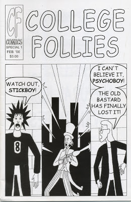
The original cover, as printed, back in 2000.
So the original version of the first issue, of which only a few dozen copies were produced at a local print shop, didn't print well. The line art ended up looking squiggly (like something out of Dr. Katz), probably from bad compression or low resolution.

This was back in the year 2000, when it was a challenge working with and storing files big enough for print and I didn't know what I was doing. Back then I had to fit all my art class projects on a zip disk that held 100 megabytes. Nowadays I have single projects that are 100 megabytes a piece. The technology has made quantum leaps, so big files are no problem now.
So when I redid the cover, like the rest of the comic, it needed to be rescanned from the original inks. I scanned in the printed comic too to pull the lettering from, since the lettering turned out okay in the comic. So all I had to do was scan in the cover, pull the word balloons and text, slap them together, add color and call it a day. Simple, no?

Well, I went through the entire process and produced a final PDF. I then double checked Comixology's submission guidelines to see if I got the size exactly right. I ended up stumbling on a bit on there that pages should not look pixelated if you zoom in to 300 percent. As I was working on it, I only viewed the cover in the size that matched how big Comixology's comics were on my computer. It never occurred to me to zoom in THAT much.

So I did...and the text was a bit pixelated. Well, ok, I'll just redo it and type the text, no big deal. But then I noticed the line art was slightly pixelated. Everything was scanned in at 300 dpi. That's print resolution. That's the resolution Comixology used in its examples. And it's...pixelated.

So at this, point I fight the urge to assume the fetal position, and again look up how to scan comic art online. I found most people recommended scanning it in at least 600 dpi. One guy suggested 1200 dpi, but my scanner crashed when I did that, so I decided 600 would be good enough.

It looked great, but then I tested it after I did background removal. You see, the scanner will get the texture of the paper, any left over pencils, etc. along with the inks so you got to get rid of that junk. One way is to scan it as text or line art, which ends up with a very poor image on my scanner. You can also try turning into a bitmap or using threshold in Photoshop but that also seemed to down the quality.

So I've been trying a technique where you select the black ink with the magic wand (by turning contiguous off, so it selects all the black, and anti-aliased off, so it gets the tightest line selection possible). Then you color those selected lines with default black (because they scan in faded and need to be darkened  up). Then I "select inverse" and  hit delete to get ride of all the background junk...and boom! All I got left is black lines and white background. This technique has created some nice looking art I've been using on my social media sites.

So I tried this technique on the cover at 600 dpi and then tested the image, busting it back down to 300 dpi as a pdf. It was better, but I could still see the jagged pixels at 300 percent. So I fumbled around for a couple hours trying different things when I found an option on the wand that lets me "refine edge." I tried it and...voila, smooth lines at 300 percent!

So at long last I think I have an effective way to scan the art work in that'll meet Comixology's criteria (and also give me high quality line art if I ever get it printed again). Hopefully, with a bit of fine tuning, this will work for the rest of the pages.


Thursday, July 11, 2013

It moves..it speaks...it's my first YouTube video!


Yes, kids, it's sound and motion! Amazing!

I had to teach myself  iMovie as I was making this. I won't say this is the first video I've ever made, because I made a couple short animated videos in a college class, but that was a zillion years ago. I will say it's definitely the most complex video I've ever made.

Making a video is a lot like making a comic, you have to think visually about the best image to put with the dialog. Except with videos you actually have to...speak.

I'm not an actor, a poet or a comedian. Hell, I barely speak out loud most of the time. So doing my first voiceover was a very different experience for me. I kind of wish I could hire an actor to play my voice (College Follies Comic Creator Blog...starring Morgan Freeman as the voice of Todd Luck!).

The audio was recorded using the built-in microphone on an iMac and I upped the volume greatly in iMovie. The quality of the recording seems to vary between recording sessions but, like I said, I'm learning this as I go along.

The pictures are all still images (jpegs) that have what's called the Ken Burns effect on them to make the camera move. They're a combination of scans, photos, screen captures and some artwork I created in Photoshop.

The movie was exported out of iMovie using its Quicktime options as a 1280p HD movie. And YouTube actually lets you enter a transcript of the video, which it automatically syncs up with the movie and turns into closed captioning. I can't describe to you how awesome that is!

It was a blast putting the video together, going through all my old art to find images that would tell my story. Brownie points for whoever can name the franchise that my five year-old self was drawing a story of in 1984 (now there was a young man who was going places!).

I'll probably do a video every month or two. I plan on doing... not necessarily "how to" videos because I don't feel like I'm really qualified to tell anyone how to do something... but rather "how I do it" videos, showing how I create the comics. They'll also be the occasional video announcements and probably a commercial for the comic once I get an issue completed. I'd also like to do a commentary on each issue of the comic after they're released.

And heck, the sky's the limit. Maybe for the sake of variety I'll do a review of a bad video game, I'm sure no one on YouTube has ever done that, right?

Wednesday, July 10, 2013

The Cover, Part 1: Gah! Color!

The colored cover art.
So the cover I posted yesterday was my first step towards turning my old college class project into the first story in my online comic series.

The first story is about my protagonists, Stickboy and Psychoboy, feeling like the whole country has turned on them. So, of course, I had to have Uncle Sam going on a rampage for the cover. The drawing of crazy Uncle Sam is a homage to the amazing cover to Batman #451 by the incredible Norm Breyfogle that has Joker shooting bats with a Gatling gun. I kept the Gatling gun cause it seemed more appropriate than when I drew Uncle Sam with an Uzi (well, "appropriate" being a relative term here...).

The cover, like the rest of the comic, was originally intended to be black and white. I never thought about color at the time, nor did I miss it. I was used to doing black and white comics. All my high school comics and character sketches had just been No. 2 pencils on white paper.

Black and white was chosen for the comic because it was intended for print, and color costs a helluva lot more than grayscale, especially if you're dealing with little print shops. But on the internet, obviously color is free, so I've decided to go full color on it.

Color completely shifts how you think about the art and becomes part of the storytelling. You have to figure out what type of blue does a crazy Uncle Sam wear. What time of day is he shooting at our heroes? And what color are those damn bricks?

Mind you. there are a few color images here and there of Stickboy and his pals, but those were just character shots for promotional images. Doing it in the context of a whole image that tells a story is completely different. This is the first time I've colored part of an actual comic. Doing a real comic image of Stick and Psycho in color made me alternate between orgasmic joy and my brain wanting to snap in two.

I'm pretty happy with the results, though since it's online it'll look different on every monitor you look at it on, which will no doubt drive me nuts. I may tweak some of the colors before the end, these things are always subject to inspiration up until they're published.

So I welcome the brave new world of color for the series. After all, how else would I have found out Psychoboy had such dreamy blue eyes?

Tuesday, July 9, 2013

The Beginning

My name is Todd Luck and I’ve been creating sequential art for as long as I can remember. When I was five I used crayon and notebook paper to create new adventures for my favorite TV heroes. In high school I used pencil and paper to create a slew of comics filled with my own creations.

In college I finally made my first real comic for a class project. Pencil and ink put to Bristol board, lettered by computer and printed in that odd size that only American comics are printed in. It was 15 pages of black and white comic bliss.

And then…nothing.

I got a job. I got busy. Life interfered.

I spent a brief stint as a political cartoonist for a college paper when I got my second degree, but that was it for my cartooning.

But the urge to create comics never left me. I was still constantly coming up with plots and characters, new worlds were always forming in my head. I was always thinking, planning, jotting down ideas…dreaming.

And now I think it’s time to act on those dreams, to pursue them the best I can with what I have. I still work a full time job, but in my spare I can create short stories that I can put online. Probably just a few a year to start.

I’ll start with College Follies, a series of humor stories I began plotting in college. I’ll dust off that comic I printed in college, touch it up and add color. Then I’ll submit it to online digital comics sites who will sell the comic worldwide if they pick it up. If they don’t, I will make it available to read online somewhere. I promise.

And so you’re invited to come along on this journey. I’ll be posting whatever I’ve been working on. You’ll be able to see me progress through the stories I’m doing, and hopefully through something bigger too. I’m hoping to find artists to turn College Follies into an ongoing series and to help turn all the other concepts in my head into dreams made manifest.

So please visit often, I’ll try to update as much as I can. You can also follow along on various social media sites (Facebook, Twitter, Google + and YouTube), which you’ll see linked on the sidebar of this blog

Below is the newly colored cover for the first issue. It’s the first step towards putting out my first story with many more to come very soon.

See you in the funny pages.