So yesterday I made the College Follies #1 Creator's Commentary video. It's exactly what it sounds like, a director's commentary for a comic. I go through the comic panel-by-panel on ComiXology, talking about it and giving insight into the creative process and inspiration for each scene.
In order to not spoil the comic, this is only available to those who buy the issue. I've already included a link in a message for those who buy the comic on DriveThruComics.com. I can't do that on the other sites. So for the rest of you, just shoot me a message proving that you bought the comic. Send me a private message on social media with a shot of the comic on your computer or mobile device. Or you could forward me the receipt of your purchase (my email is at the top of the letter column in the back).
I've wanted to do this since I started working on the first issue. A nice little experiment and something a little extra to say "Thank You" to those who buy College Follies. I hope you guys enjoy it.
Click here to get the comic.
Showing posts with label making the comic. Show all posts
Wednesday, June 25, 2014
Tuesday, June 17, 2014
College Follies #1 is out on Comixology!!!!
College Follies #1 is now on Comixology. You can buy it and read it either online on your computer or your mobile device. You can also buy as a gift and give it to friends. Click here to get it!
Not much to say right now. I'm glad it's finally out and I hope you guys enjoy it. Please let me know what you think when you read it!
Friday, June 13, 2014
College Follies Now Available On Amusedom and DriveThuComics!
College Follies #1 is now available for purchase!
I've early released it on both DriveThruComics and Amusedom! Amusedom is a digital comic format you can read on your web browser and has both the regular and variant cover editions on there. DriveThruComics has PDFs of comics you download to your computer to read. Choose either, choose both...buy more, be happy!
The ComiXology release will be in the next month or two if you'd prefer to get it there. Regardless of where you get it, it's only a $1.99 online! For those wanting print copies, I'm selling those at conventions currently for $2.99 and will open those up to online sales in the fall.
So be the first to buy the issue by clicking on either of the images below! And be sure to drop me a line and let me know what you think!
Monday, April 28, 2014
COLLEGE FOLLIES WAS ACCEPTED BY COMIXOLOGY!!!!
The title says it all. I got my acceptance email from Comixology! I honestly don't know any more than that at this point. They'll let me know when it's ready for release.
Today's my birthday and to have my lifelong dream of having a comic nationally distributed come true is one helluva of a present!
I've got a long night at work but it's great to know my hard work on the comic has paid off.
Wednesday, April 9, 2014
COMIXOLOGY RESPONDS!!!
So I opened my email yesterday and, after a five month wait, saw an email entitled, "comiXology Rejection." Fighting the urge to curl up in the fetal position under my desk, I clicked on the message.
A few paragraphs in and I read "Your submission has been tentatively accepted." What??? Really??? Awesome!
But then it goes on to say "however there are issues with your submission that need to be resolved prior it being fully accepted." Well, okay, it must be some sort blaring problem that will be quick and easy to fix.
The problem?
"Lettering not up to industry standards: Comic Sans"
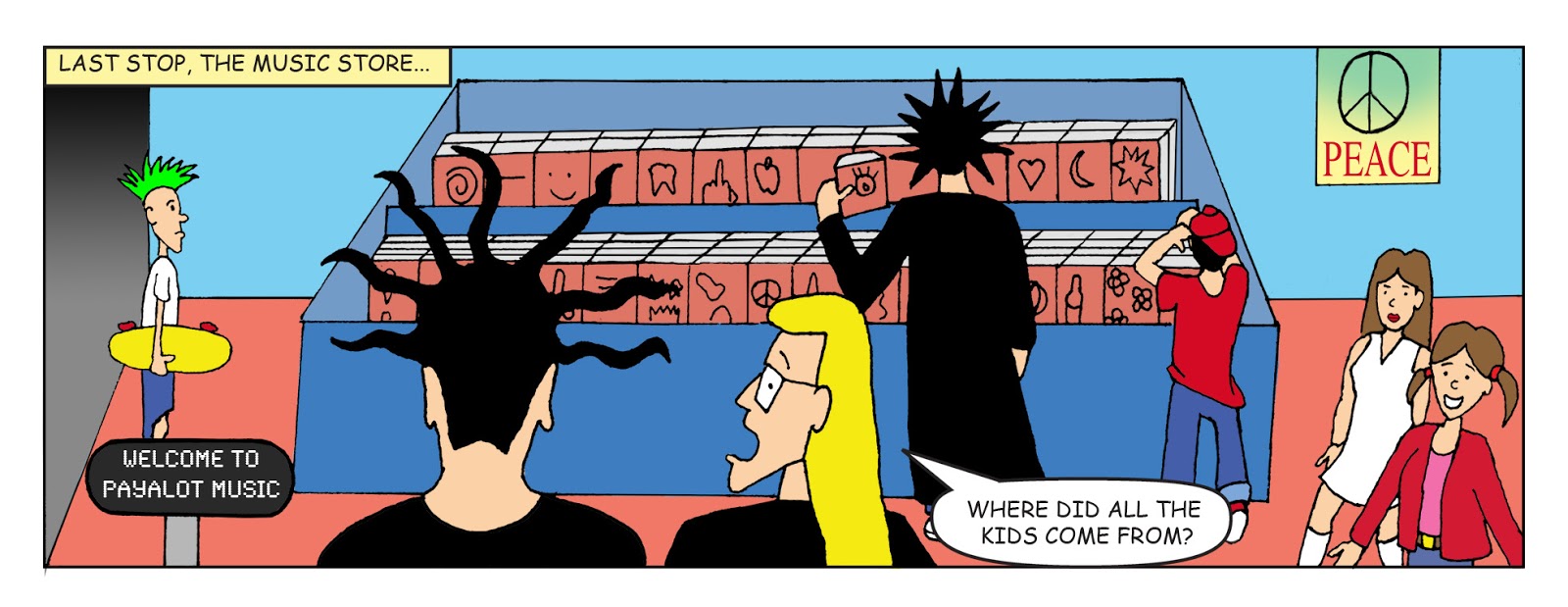
So I don't have a picture of my reaction but this panel of Stickboy should give you an idea of the look on my face...
The email had links to sites that sell and also give away fonts. So after I looked it up, apparently using Comic Sans causes an automatic rejection from Comixology. If this was mentioned anywhere in their guidelines I certainly didn't see it.
I've had a lot of feedback on that first issue over the years. At no point has anyone had complaints about the kerning or the shape of the letters. But, hey, it's their site.
So glass half empty, I now have to go through word balloon by and word balloon and change every bit of dialog (plus the logos) in the first issue. I'll have to eventually do that for everything else too. This is time I really didn't want to take out from working on the third issue. Plus, the letters are part of the comic, which is kind of time capsule of its era, so Comic Sans seems appropriate for that.
Glass half full is that I found a newer free font through one of their links that's very close to Comic Sans so the look shouldn't change much and it won't require too much work to make sure all the redone text stays in its balloons. And after I do this, it sounds like I have a good chance of getting on Comixology.
Let me repeat that they did say I was "tentatively accepted" except for the font. So potentially once I get this done the world's biggest digital comic distributor will pick me up, which would be amazing and a dream come true! Stay tuned kids!
Saturday, March 22, 2014
Comic printing update
I'll begin digitally inking issue three tonight but I just wanted to drop you guys this little update. All the preparations that needed to be done to print issue one are done and it has been sent to a digital printer who will be printing a small run for me to sale starting at a convention at the end of April Both the regular cover and God Awful Variant Cover edition will be available to buy for $3. I'll be selling these at cons and then, once the digital edition is released, I'll be selling them online as well.
I also sent off for 11x17 prints to be made for of the first issue's cover. Other prints will be done later, but that seemed to be the most popular and relevant image I had at the moment. The prints will be $5 at cons and will also be available later online.
The reformatting for print required me to create extra space around every page (called a "bleed"). The comic wasn't made with this in mind so it's taken some doing to rework the cover to create that space. Photoshop Elements also can't do CMYK (which is the color scheme for print) so I have to run to the office anytime I needed to makes changes to them. It's been a little nerve racking. I just got back from the office, correcting what I hope is my last oversight ( I forgot to put the price on the cover).
I've pretty much got issue two ready to go so sending the regular edition, variant and prints of the covers should be relatively painless when I'm ready to do that, which will probably be before the next convention in July.
And for those of you who recall, this is supposed to be a digital comic, and yes, it still is. Comixology is still reviewing it and didn't have any updates or estimates on much longer it will take. I'm hoping they give me a response before the con so I can have fliers, etc. announcing a release date on the comic but at this point it may be summer before I hear back. I'd like to think this means they're giving it serious consideration. It's strange in this day and age a digital comic will be available in print before it goes digital.
Anyway, all this has been slowing down the work on issue three so I'm glad to finally have it behind me. Onward to new finished pages!
Friday, March 7, 2014
College Follies: The God Awful Cover Edition!
Didn't have time to draw a page last night and decided to wrap up one last relatively quick image I needed done before checking into print-on-demand. Below is the variant for issue one (the original is pictured to the side). Everything but the word balloons was inked by hand. I'll see if I can't get the variant covers done in print-on-demand (the price on the cover reflects what the print issue's price will be). If not, they'll be available on Amusedom at the very least. I've been wanting to do this one for awhile....Are you the type of person who has to who loves to buy variant covers that look like ten minute convention sketches when the regular cover is a spectacular painted master piece? Well, have I got a variant for you that has mastered the art of underachieving! I present to you the College Follies God Awful Cover Variant!
Thursday, November 7, 2013
First issue: The Lessons Learned
First off, I'm very pleased to say that all the technical issues with the Amusedom version of the first issue have been ironed out. It's good and ready to go. I'll be waiting on a response back from Comixology before I schedule a release date, but it feels great to have it done.
Pencils- It's hard to draw when you haven't done it in awhile and I've lost a lot of years I could've been honing and improving my skills. That's my mistake. I should have never stopped making comics. Now I got to play catch up.
Inks- Similar to drawing, very hard to get used to doing again. Inks are especially hard because of the precision required. No erasing, no backsies. Wite-Out can only help so much. You really have to be a surgeon with an ink pin to create lines precise enough to hold up at the size Comixology wants it to. Lines that look fine in full size print required major work for digital.
I was pretty comfortable doing the computer touch ups and I'm going to experiment with the Wacom tablet I just got today to see if I can ink the pages digitally.
Color- This was really interesting since I've never worked extensively in color. The first thing I discovered is that color is sometimes relative and defined by the colors around it. A specific color may look dark on one panel and faded the next depending on the colors around it.
I also learned that color can tell as much of the story as any word or line can. It can have its own meaning, themes and humor just like any other part of storytelling.
Letters- I relearned how to use Illustrator to letter. Didn't really discover too much new about lettering itself other than how awesome it is to drop out the lines on logos since it'll show up on a color background (like I did with the CNBC and NIN logos).
I'm hoping I can figure out a way to do lettering in Photoshop so I don't have to buy Illustrator at home but that remains to be seen.
Submitting to digital comic sites- Read up. Do your research and be prepared for half of it to go out the window at some point. Be ready for anything and don't be shy about asking for help.
With issue one behind me, I'm taking few a days off of work to rest and recuperate before I get started on story two. I'll still be blogging during that time, so keep your eyes on this spot.
Sunday, November 3, 2013
First Issue Submitted!!! Part 2
I can already say that within a couple months you will definitely be able to buy the first issue on at least one site. No one is more surprised at that than I am.
The second site I submitted to was Amusedom. It's a smaller, less streamlined site, but I'm in good company on there with Moebius and Joe Jusko galleries, Asylum Press, Heroic Publishing, Elephant Men and the amazing M3. I heard about the site at Heroes Con in Charlotte from the creator/writer of M3, Erica Schultz. I thought it was just a site you could submit for free and it would just give you a bigger cut of the sales than Comixology.
After getting around technical difficulties (thanks to some Twitter advice from Mrs. Shultz) I was able to finally upload my pages last night...and much to my surprise they just automatically became a digital comic! There is no review process. You just upload your comic, set the price and your portion of the sales go to your Paypal account.
I was amazed! Now it's not ready to go just yet. There are some technical issues that will require me to re-save and re-upload the files. In theory I should be able to iron those out this weekend, if not, definitely in the next few weeks.
An early release like this wasn't planned. I'm taking time off for some recuperation starting the later half of next week. I'll be breaking in a new Wacom tablet and Photoshop Elements on my personal laptop that will hopefully make the whole creative process easier. And I'll be starting on the second story very soon.
So in the middle of all that, I'll need to figure out what the best way to let everyone know when the first issue is out and how to link you guys to it. I'm still deciding when the best time to release it will be.
Amusedom's digital comics are similar to Comixology just without the guided view and I don't think they have a mobile app. The site is relatively small and a bit dated (they've got MySpace and AIM on the share options). It's no substitute for a larger Comixology release but it definitely is a good way to get it into the hands of readers.
Right now I'm thinking about waiting to hear back from Comixology. If they reject me I can use just hit a button and the comic goes online anyway. If they accept me, I might go ahead and go live with the Amusedom version to give people who want it early access.
So give just give me a little more time and the first issue will be to you guys in all its digital glory soon!
Friday, November 1, 2013
First Issue Submitted!!! Part 1
Movies aren't released, they escape. The same holds true for comics.
I've looked over the comic several times. I made a last round of corrections on things that, honestly, are so small they probably won't even be seen by readers. I could touch up it forever, but at some point you got to say "done" and release it, knowing it's a good comic and that it's far, far better than it's ever looked before.

The comic has been submitted to Comixology, the biggest digital comic site there is and the industry standard for digital comics. It'll take months for them to review it, and then convert it for their site and app if they accept my submission. If they take it, it'll be converted into guided view, which will givers viewers the option of seeing the comic one panel at a time and lets you navigate between panels with the press of a button (or a swipe of your finger or stylus). Though not designed for guided view, the comic should be pretty much perfect for that with its panel layout.

So submitting to Comixology was a long, but easy process. I'd been making the comic all along with Comixology's requirements in mind, so the pages were already in the right format. I had to include square images of my company logo and of myself, but since I already made both images specifically with Comixiology in my mind, that was a cinch.
I also had to make a new square image for the series itself. You can see some of the images I considered on the side. The group shot from the College Follies Facebook page looks good, but just wasn't legible when shrunk down the to the size viewers might see it at on Comixology (it may appear at roughly the size of an avatar when listed with other titles). The yelling Stickboy one I also liked, but I didn't think it was as immediately, unambiguously readable as the one I went with below.
I'm also submitting to one other site, but I'll deal with that in a later post as I'm trying to figure out what's going on with it at the moment.
NEXT: Submitting to Amusedom!
Friday, October 25, 2013
Back Cover Done! Issue One Finished!!!
It ain't over the til the fat lady sings or the skinny boy begs you to follow him on social media!
![]() |
| The original stand from 2000 |
The filler ad for the back cover is done! For the image of Stickboy, I took the original inks I used for a tiny promotional stand I did back in 2000. Little Stickboy (shown on the right) actually did sell a few copies of the comic at Heroes Con in Charlotte back in the day.
Here I've repurposed the image for an ad begging for followers on my social media sites. The "Begging Stickboy" image was done quickly and sloppily back in the day so he required some clean up before he got blown up.
Filler ads, especially on back covers, are pretty common in comics as advertisers have gone elsewhere to promote their products (and, heck, Comixology doesn't even allow paid ads in their comics). This one I plan to reuse for the back cover or inside back cover of future issues (it's one less page I have to make for future comics).
So at long last the entire comic is done, cover to cover! Issue one is finished! I've still got to look it over and submit it, which I'll be doing in the next few days...
Thursday, October 24, 2013
Inside Back Cover Finished!
The inside back cover is done!
This is the inside back cover as it existed in 2000, just colored with inking touchups. This is inspired by the back cover (or sometimes inside covers) of books or trade paperbacks. I used artwork I had laying around and wrote a couple paragraphs. It was a quick way to fill space but, man, I love this page! The top has a disclaimer in it that's a great gag, but I won't show it here since it would spoil the ending of the story.
The big image is the initial Dark Knight Returns homage image I did back in the day. It was nice to get it in there. Of course, I have a much better version up on my personal Facebook page, which I've already detailed in a prior post.
For the author shot, I think that's a reworked self portrait I made for my student website. That bio is of course, circa 2000. I'm no longer a college student and, sadly, I also no longer have a nifty girlfriend. I do, however, still have a cool comic collection.
Just got to do the back cover and I'm done!
Wednesday, October 23, 2013
Letter Page Done!
The letter page is done!
The letter page is a time honored tradition of comics, publishing readers' comments, fan art, etc. And part of that tradition is, since a series won't have letters before it's published, filling the first letter column with an editorial of some sort, whether it's just talking about the creators, the direction of the book, how the series came to be or just about anything else to fill the space.
So it's an absolute thrill to have my letter page become a part of the digital release. It features my editorial on Columbine that ran in the print comic in 2000 with a new section at the end talking about the digital College Follies series.
An additional change was that the original "MAIL TO" went to my actual home with my (now defunct) student website and email at the bottom. This needed to be changed since I no longer live there anymore (I was living with my then-inlaws, who probably don't need to receive any more mail about this comic). Because email has become so prominent now I've included my email instead of a physical address. I will say I miss seeing a full mailing address at the top of the letters column, but such are the times we live in.
I plan to have a regular letter column, regardless of if I get letters, as a way to communicate with the reader and let them know what's going on with the series (something I feel is sorely missing in many modern comics). But I do hope I get letters once it's released. And if I get any attached with crayon pictures of my characters drawn by little kids, my life will absolutely be complete.
Sunday, October 20, 2013
Page 15 Done! First Story Finished!
Darn straight Stickboy!
So page 15, the final page of the first story, is done! That one panel is the only finished image I can show without giving the ending away, but lets just say it's really good and was always my favorite part of the story. And, no, Stick and Psycho don't drive over a cliff Thelma and Louise style.
But a finished story is not a finished comic. As anyone who's ever laid out a publication knows, there's no such thing as a comic with 15 interior pages. Pages are printed on the front and back of each sheet so there has to be an even number of pages (16 in this case). And since I had a cover and inside cover (title page) I had to have a back cover and inside back cover. This is true of the comic when it was printed in 2000 and remains true even now as I turn it into a digital edition.
Thus, I've got the following pages to do:
1) Letters page (taken up by an editorial)
2) The inside back (with an old author bio and a humorous disclaimer)
3) The back cover
The first two will be scanned, in but should require little work to color/update for this new release of the issue. For the last one I'll be creating a brand new house ad plugging College Follies on social media, which should be relatively easy too.
I've also got to make some very minor corrections on some of the pages and proof the comic. Though the comic was thoroughly proofed back in the day and I've been looking over and reading over it during the entire process, mistakes could happen at any point in the process. I want to get this right.
I plan on getting a lot done next week. All this may be knocked out within the week and I'll be submitting it by the weekend or I may be submitting it the middle of next week.
Either way I'm super glad to be in the home stretch on this incredible creative journey and look forward to the next one, as I finally finish the second College Follies story after 13 years!
Saturday, October 12, 2013
Page 14 Done!
So page 14 is done! Only one page left in the first story!
To avoid spoiling the ending, I can only show you a fraction of a panel and none of the dialog, but trust me when I say it feels really good to see the story's final scene in color after all these years. I printed this comic 13 years ago and thought I was done with it, but after I touch up the inks and color each page, I feel like they're complete in a way they've never been before, like this is the way they should've always looked and I just never knew it.
I'm happy with the way the comic is turning out. After the final story page I'll have a few other pages I'll need to scan in or create for the back of the issue (an editorial to fill the letter column page, etc.). So it'll still be two or three weeks before it's all done and then I'll be submitting it to digital comic sites like Comixology. I can't wait!
Sunday, October 6, 2013
Page 13 Complete!
Page 13 is done.
This begins the final scene of the first story as Stickboy arrives at the local school prom to meet Psychoboy...
As you can see they've tightened up the security a little. And Stick's looking pretty good in a tux.
And then we meet Psychoboy's girlfriend for the issue, Lisa aka the excuse to have our heroes visit a high school in this story. This is probably her only appearance as Psycho changes girlfriends (and everything else) every time you see him. She's inspired by a girl I went to college with, who was one of the few people I've met who I thought "Yeah, she looks like a character in College Follies."
Not too many more panels I can show without spoiling things, but I'll throw this one in here since it's the one of the few panels without dialog in the entire issue...
I'd also like to note this is the first scene that takes place at night, so I had figure out what color the night is. In this case it turned out to be dark blue. All the background colors are a little darker than normal, but I didn't want to get in the trap a lot of modern comics get into where everything is colored so dark you can't see the line work. It's important finding that balance to letting the reading know it's a low lit scene and making it too dark to read.
So I'll leave you with one last panel to ponder and that's all you're getting out of me on this page. Only two more to go!
Sunday, September 29, 2013
Page 12 Done!
So page 12 is done. It wraps up the scene at the school that began a couple pages ago. Again, this is inspired by the frequent local bomb threats just after Columbine and how they always ended up on the local news. Here's some panels from the page...
The rest of the walking kids are generic designs. The reporter is again just an attempt to make an interesting looking character. I love her hair. And then there's her interviewee...
He's inspired by Bobby from King of the Hill. Read his dialog with a Texas accent for full effect.
And then we have what I would think is the more typical reaction to school getting dismissed...
The kid in the white jacket is the last one based on my unpublished heroes. I don't think it was intentional, but his power is flight so it's appropriate he's the one in midair. The kid in the darker clothes is inspired by Alexander Darque in Unity 2000, a miniseries that Jim Shooter was writing at the time.
Meanwhile, inside the school...
Not cracking on cops, obviously they're obligated to check schools for real every time there's a threat, and do so in real life. I suppose this is what I thought they should be doing instead, since it always turned out to be a stupid hoax. I was all kinds of happy when I found the perfect orange for their vest. And while figuring out the colors for the donut box, I realized my 20 year-old self had intended for it to be a Krispy Kreme box and that brought a big smile to my face for some reason.
So that's it for page 12. Next, the final scene begins!
Sunday, September 22, 2013
Page 11 is finished!
Page 11 is done.
Again, I'm only featuring part of it to avoid spoilers. This was a quicker page because most of it was taken up by the big panel below. Bigger panels require a lot less work and I can kind of understand why a lot of modern comics are so reliant on them. If I made the rest of the series one panel a page close ups of Stickboy's face it would cut down on the workload. But here I felt a bigger image was justified to show how many news vans and such were closing in on the school. And yes, our overly excited principal is saying something in the corner panel, but I've taken it out so as not to spoil the scene.
This big panel is dealing with how newscasters would flock to schools that dismissed due to threats (which were always hoaxes where I lived) just after Columbine. I've always liked the line about not wanting to get blocked in by CNN. Incidentally, now that I'm a newspaper reporter, I have had to do an extra circle around the block when news vans take up all the parking around a heavily covered event. It's life imitating art or something like that.
Only four pages to go in the first story!
Sunday, September 15, 2013
Page Ten Complete!
Page ten is done and I'm two-thirds of the way through the first story! As I said, I'll only be showing some of the finished panels from the remaining pages of issue one from here on out so as not to spoil the whole thing before it's released.
So our heroes finally reach their destination...
The car was just something that was easy to draw back when I did the comic originally. I sort of wish I'd come up with a stranger car for Psycho now, but it's only one panel and he'll have a completely different vehicle next time you see him. He'll probably be keeping the license plate though.
So they're at a high school dressed in black trench coats? Nothing could go wrong there, could it?
Hey, look, it's a good guy with a gun! Our hapless school resource officer is inspired by Officer Barbrady from South Park. Again just a passing resemblance, I wasn't going for anything precise, though I do hear his voice every time I read this guy's dialog.
On no, not a "Bom"! I tried making this restroom look as rundown and disgusting as possible. I'm pretty sure it violates the Geneva Convention or something. The letter here is my own scanned-in handwriting. This page was inspired by a real local incident where a school was evacuated shortly after Columbine when a threatening note was found in the boy's restroom, which is the strangest place I can think of to put one (it, unsurprisingly, turned out to be a hoax).
So that's it for this page. You'll have to wait a bit to see how that little gag is resolved, but you will get to see what happened to Stick and Psycho afterwards as I tackle page 11 next week.
Until then, people, move along, there's nothing to see here...
Sunday, September 8, 2013
Page Nine Complete!
Okay, so I've already posted the complete pages for a little more than half of the first issue. At some point I'll gather these into one place for an easy to view preview of the story. But in the interest of not giving away the entire thing before it's digitally published on Comixology or whoever takes it, I'll be posting samples of the pages from here on out instead of the whole thing.
So as I said, page nine is done. And this one takes us to the traditional mall stop of the music store...
Okay, not MY usual stop (probably why I show Psycho looking at the music while Stick's chilling), but a common one, none the less. The store name was basically inspired by how expensive music (and just about everything else) is at the mall.
On the CDs in the background (those are thicker, multi-disc ones on the back row), I used a coloring technique I've avoided thus far of making background objects one color. When I started this, I thought colorists only did that to either be lazy or because their brushes weren't fine enough to color very tiny details. But when I was doing this panel, I remembered a blog Jim Shooter did on coloring in which he said that color (like inks or pencils) should create depth by having things that are more specific and detailed in the front and things that are less so in the back. So it occurred to me coloring each individual CD and the cover art on each might make the background too busy in an already busy panel and distract from Stick and the characters the reader needs to focus on. If Jim Shooter says it's okay to do it, that's the final authority to me.
And then we have Stick talk to the music store clerk...
The design on him was just me trying to figure out how to make a music store clerk look interesting. Nine Inch Nails is one of favorite bands, so putting its logo on his shirt was the first thing that came to mind. It was a lot of fun creating the logo since, like I said, I love the Nails.
There were A LOT of false alarms sent to schools nationwide after the Columbine shootings that I'm lampooning here. It turned out children weren't homicidal mass murders, but a lot of them were insensitive pricks who thought something like that was funny.
And that's it for the preview of this page. I promise you'll be able to read the whole page (and the rest of the comic) once it's released. Let me know what you think of the new commentary format here.
So next up is page ten, when our heroes finally arrive at the county high school...
Subscribe to:
Posts (Atom)


